
Redhook
Rebranding and Packaging Redesign
An icon among Seattle craft brewers, Redhook was looking to stand out in an increasingly crowded beer aisle, and to reclaim credit for their heritage. We determined that Redhook sat in a special place with consumers as a symbol of Seattle’s hard-working blue collar past— a“Well-Built Beer” that could be a bridge between the iconic simplicity of big beer brands, and the more precious (and more complex) design aesthetic of craft beer at the time.
As a beer afictionado and homebrewer, this project hit my sweet spot!
Role: Senior Designer at Hornall Anderson

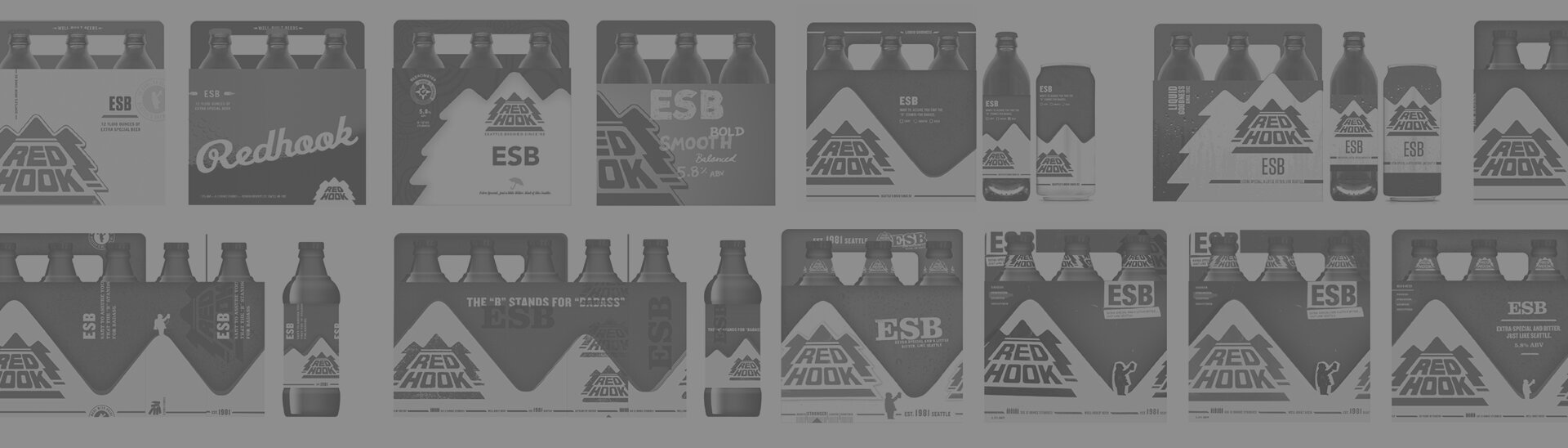
Forging the New Look
Our design took several steps to create an impact and shoppability at shelf, employing a billboarding mountain range device, bold typography and even a “beer-o-meter” to aid newbies in a selection. The visual toolkit included a stripped down logo and gritty textures and composition evocative of its hard-working roots, and a recurring character of their unofficial Weatherman mascot to act as a conduit for their brand voice.


Tap the Spirit
One of the happy spinoffs of our branding and packaging redesign was to redesign Redhook’s tap handles. We ideated a keg load of concepts, from whimsical to PNW-themed, repurposed materials to industrial. The winning idea centered around an interpretation of the packaging, a universal base with interchangeable product toppers, readable from all angles.


