
Rice-a-Roni
Packaging and Brand Redesign
“Rice-a-Roni, The San Francisco Treat!” Consumers of a certain age will likely remember that iconic jingle. Little had changed with their brand or packaging since those days. Roni (both Rice and Pasta products) tasked our team with bringing the product line up to date, making it feel more premium (yet still accessible), cohesive and shoppable.
Role: Lead Designer at Hornall Anderson
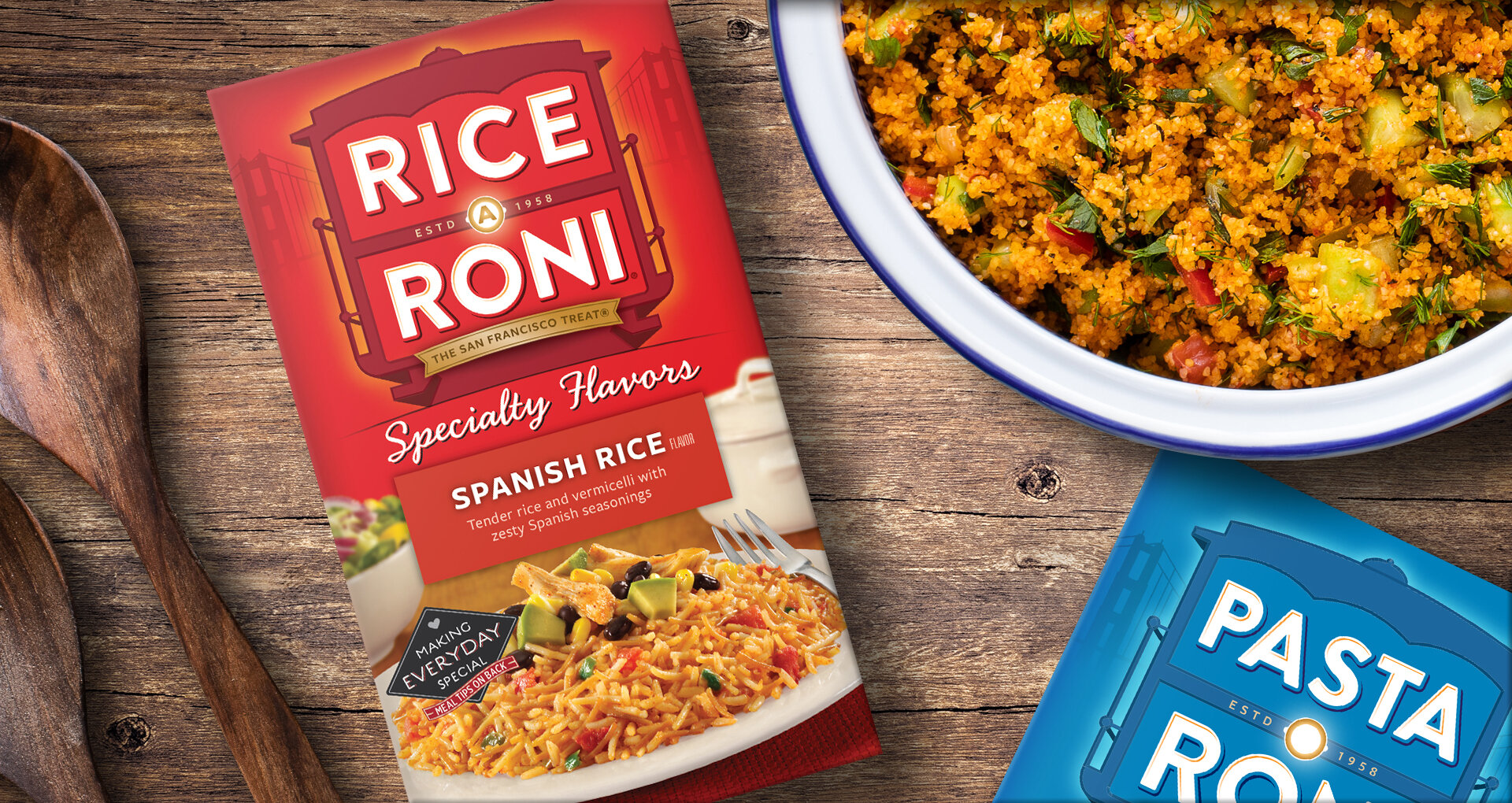
Ding, ding! We explored several ways to emphasize the Roni brand, using the billboarding effect of multiple SKUs to our advantage. Just as importantly, we faced a legitimate challenge of product navigation: across 2 platforms with 3 subcategories and 15-20 flavors each. To accomplish this, we leveraged naming, unique typography, color and photography of food and props. We would present these in digital shelf sets for additional context.


Roni’s ever-present cable car also received a much-needed update. We simplified and clarified its overall impact while taking greater care with details. All the while, we increased visual continuity across rice and pasta.


